OH MAN THIS BOOK. I am a little bit of a mindless space zombie (not the murdering kind) today because I was about halfway through reading it last night and I told myself I would stop as soon as I got to a lull and then it never happened. No lull! I read the whole thing through and then was so amped I almost woke up Dave to talk about it. It's good, man. Believe the hype.
Originally I planned to read it before last weekend, when I was on a panel with Jay and Amie, but something (baby) kept me (baby) from my regular reading schedule (baby baby baby). So instead of me fangirling about Illuminae, we chatted about things like tattoos and Reasons One Should Visit Melbourne, Magical Land of Beaches and Platypuses (platypi?). They were so lovely.
As for the chalkboard drawing--ooof it was a challenge. I hadn't gotten a close look in person before deciding it would be my next drawing,* so I didn't realize that the cover is actually this gorgeous, almost watercolor-like, translucent jacket over a stark white back, so that certain things (the white text, some handwritten notes) pop through. I love it. In person. Not so much in chalk, where it was a pain in the butt to get everything just right.
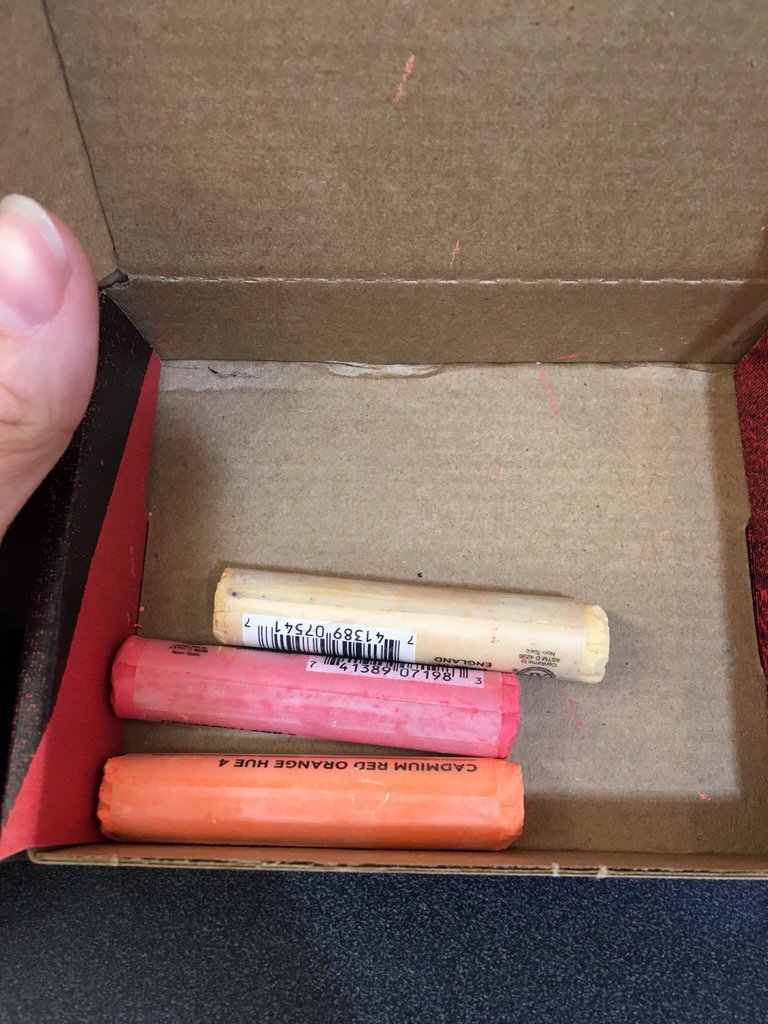
Since the colors were pretty simple, I wanted them to be perfect, so I headed out to the art store to color-match chalks:
These are the Blick basic pastels, and I'm a little so-so on them. They go on really smooth, almost slightly waxy or oily, so the colors are nice and bright and they still erase well. But man do they crumble. By the time I finished the drawing, there were so many little bits of chalk on the floor, my slippers looked like this:
But still, I was happy with how they all blended together, even if I knew that attempting the gorgeous blooming firecloud on the original cover would be out of my ability. I wasn't sure how it would look all together, but as soon as I started adding in the details, the words, and finally the little stippling over everything, it actually turned into something really nice!
Now I'm going to go collapse on my face forever.
Dave's first-view reaction: Woah! That's so awesome! You're amazing! How did you do that? It looks so good! [I ask him if he likes it better than the last one] What was the last one? [The Western? It was on our wall for a week.] Oh yeah. Yeah, this one is way better. [I tell him this one took an hour. The Western took almost four hours.] Well, I'm not judging it based on time. [I ask him what he likes so much about this one. He thinks.] Colors.
More pictures after the jump!
*I made the rookie mistake of getting an ebook before realizing it's a beautifully illustrated, stunningly designed, typographical dream. After 40 pages of squinting at my Nook, I bought a hard copy.
I thought I'd take a picture of the whole wall, so you can see how big it really is.
Ignore the bad paint job :(
Ignore the bad paint job :(
I did the small black lettering with my charcoal pencil and I was so pleased with how it turned out.
The little shadow of white around the lettering also looked really lovely
The little shadow of white around the lettering also looked really lovely
If you take off the jacket, you can see what looks like a classified report, typed up with all these handwritten notes in red pen.
It looks awesome in real life and just sort of confusing on my wall.
It looks awesome in real life and just sort of confusing on my wall.
In which I brilliantly forget to lay down the yellow highlighter before trying to do the lettering
Noooooo bluuuuuurbs
Why couldn't have just been "It's great! -An author"?
Why couldn't have just been "It's great! -An author"?
"dinkdinkdinkdinkdinkdinkdink"
"How long are you going to be doing that?"
"How long are you going to be doing that?"
"Why? Is it bothering you?"
I had to jettison so many cool little details for it to make sense in chalk,
so I'm going to suggest you just buy yourself a copy
so I'm going to suggest you just buy yourself a copy


No comments:
Post a Comment