
Hey wow, look, more murals!
For the last year+, every time I walked into my living room
to see that damn Winter cover, every
time someone would come over to the house and say “Wait is that the Yahoo CEO?,”
every time the seasons would change (winter to spring, spring to summer, summer
to fall, fall back to winter), I’d be reminded that I need to switch up the
chalkboard. But I was soo busy!*
Finally, last weekend, I made up my mind. I had an hour free
before the baby woke up and there was nothing on Netflix, so I broke out the
projector and the chalks and picked up one of my recent reads, the sci-fi smash
sequel, Gemina!
This is the second book in the series (I did the first book,Illuminae, last year) and oooooohhhhh
man I loved it! It sort of reminded me of that Calvin & Hobbes cartoon
where Calvin ups the stakes playing with his cars by throwing in AN EARTHQUAKE!
A B-52 BOMBER! PILOTED BY DINOSAURS! By which I mean, this book had gangsters
and Special Ops and wormholes and brain-eating aliens and great little drawings
(by bestselling author Marie Lu!) and MORE. It was so so great and I devoured it in about three days.
Just like with Illuminae,
my little chalks do not do this gorgeous cover justice. It’s this beautiful
pale blue nebula, surrounded by black, printed on a stunning plastic dust
jacket so you can see hints of the cover underneath. It’s fantastic, and you
should absolutely pick it up and read it immediately.**
If I had to do this again, I think I would have gone shopping for a wider range of blues, since I (wrongly) assumed I had more than, like, three different shades. I knew there was no way I could replicate the different layers in the nebula, so I decided to create the whole thing in layers and blend it all together. It sort of worked!
If I had to do this again, I think I would have gone shopping for a wider range of blues, since I (wrongly) assumed I had more than, like, three different shades. I knew there was no way I could replicate the different layers in the nebula, so I decided to create the whole thing in layers and blend it all together. It sort of worked!
So many more details, PLUS A VIDEO, after the jump!
Dave’s first-view
reaction: Huh. You did another one? ... You know what would be really nice? If
you took a picture of Cambridge, like on the river, and did that on the wall
instead.

My two favorite Aussies <3

I love the combo of types, from the big bold title to the handwritten details
to the typewriter style to the sort of shaky <ERROR> messages
to the typewriter style to the sort of shaky <ERROR> messages

A spot of red! I had to search long and hard for this color

<ERROR>

SO MUCH <ERROR>

Highlighter! This was fun to do, although less fun when I forgot about it
and had to erase the letters to put it underneath (lowlighter)
and had to erase the letters to put it underneath (lowlighter)

There are so many fun little details on the cover, most of which were difficult or impossible to replicate on my chalkboard (see: the very fine white type that runs along the left side), but I wanted to include a few, starting with this redacted letter header
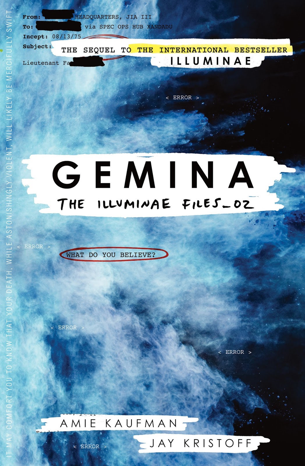
The gorgeous cover! Seriously it is too pretty
*Okay here’s where I admit it was less because I was busy
than because I wasn’t reading much YA. Like, any. Sorry, friends.
**I’m not just saying that because Jay and Amie put me
stabbing someone into the third book…
No comments:
Post a Comment